

 Most of us can look at an artwork and immediately decide if we like it or not. We might not know why, but we form an opinion in a split second. Our eye recognises “good design” subconsciously.
Why is that? Because we, humans, have an inherent ability recognise patterns and designs. Yes, personal tastes vary, but there are universal rules that make a design “good”. In other words, what makes the design work, deliver the message we intend for it.
So for Week 7 of my drawing challenge to learn how to draw kawaii in 6 months I have researched ways to create interesting, appealing and memorable designs.
Below are the secrets to making your artworks look good!
Include Meaningful Content

PicCandle drawing on a “Happy Birthday” theme
Random doodles work well, but doodles on a particular subject are so much more memorable! For example, you can make kawaii drawings of the foods you eat this week. Or create a kawaii collection for the current season.
If you don’t know how to draw something, find an example on the internet. Searching Pinterest for “doodle” brings up really good results! Over time, you (and I!) will hopefully build up a large library of images to draw from memory.
Another way to make kawaii artwork meaningful is to include words in it. Here is an example from PicCandle:

Use Consistent Style
The artwork will look best, if the drawing style is consistent. For kawaii drawings and doodles, use similar kind of lines for the whole artwork. Here is an example of a seashells doodle. The colour and line quality are the same for all shells, which makes it look cohesive.
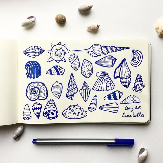
Sea shells doodle by erdenec
Another design trick to achieve consistency is to repeat the same (or similar) shape throughout the artwork. PicCandle does this well in her illustration of the pandas. The pandas’ head and eye shapes repeat, which makes the illustration look balanced and consistent.

Balance Out Drawing Elements
There are two main ways to balance a drawing, symmetrical and asymmetrical.
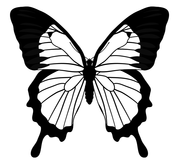
If you distribute the objects in your drawing evenly, it is called symmetrical balance. It’s safe and somewhat conservative. But it can also be visually boring. Symmetrical balance can work well for wedding invitations, tee shirt designs, typography posters.
Butterfly is an excellent example of symmetrical balance:
Another kind of balance is asymmetrical balance. That’s where one side of the drawing has more elements than the other. Asymmetrical balance creates interest, energy, even tension in the picture. But it’s harder to make it look good. Too much “weight” on one side, and the viewer will feel overwhelmed by the drawing. You will need to counter-balance the other side of the drawing by including a strong element there.
To counter-balance the design, think of objects as having weight. For example, a large dark circle has visually the same weight as a group of smaller lighter circles.

Here is a poster design that demonstrates asymmetrical balance. The strong red circle and tower are counter-balanced by decorative text “Paris”, a paragraph of text and black underline.

Think of balance in your drawings, when deciding how to position elements, what areas to make dark or light, and when adding textures.
Position Elements According to Design Rules
It might seem that a kawaii collage is just a random arrangement of shapes, but that’s not the case. For best results, apply these design “rules” when positioning your drawing elements.
Establish a point of interest
Make sure there is clear point of interest. Where do you want the viewer to look first? If they remember only one thing from your artwork, what will it be?
The eyes are attracted to the areas with highest contrast, strongest texture, or if there is literally an arrow pointing at it (ha!).
Use the good old rule of thirds. Divide your artwork into three rows and three columns (you can just do it in your mind, no need to draw the lines on the page) and place your main drawing elements at the points where vertical and horizontal lines meet. This makes the artwork look more aesthetically pleasing.
Here is a painting by Brandon Schaefer that uses both point of interest and rule of thirds.

Use spacing wisely
Keep the edges of the artwork free of elements that may stand out. If you place high-contrast elements (colours, shapes, textures etc) near the edge, the eye will go there and will “fall out” of the picture. You want to keep the viewer’s eye in the picture, where interesting action (and your story!) takes place.
“Keep a cap on it”, as my art school teacher Richard Porter used to say. An artwork looks best, if it has less empty space on top (hence, the cap) and more empty space on the bottom. Here is an example of a still life by Craig Shillam, in which there is very little space on top (above the green pepper), but lot’s of free space below the peppers:

Remember to include some white space. White space doesn’t actually have to be white. It’s just empty-ish space where the eye can rest, as it travels around the picture. Don’t try to fill up every square inch of the artwork with “stuff”.
Be mindful of action space. Action space is empty space in the direction where action takes place. If you are making a drawing of a character running from right to left (see reference below), leave some empty space to the left of the character. This enables the viewer to imagine how the action will unfold. It’s like creating a stage for the action to take place :).
Use Eye-catching Shapes
To make the artwork memorable and eye-catching, you can arrange the overall design into an interesting shape. Some of the shapes that work well are: circles, triangles, hearts. Square is a good shape too, but it is more common and therefore can be less memorable.
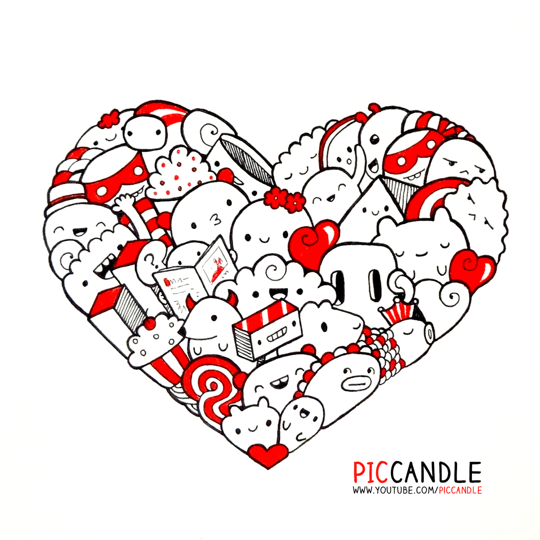
Zainab Khan (Pic Candle) arranged one of her doodle in a heart shape. It looks very sweet.
My Drawing This Week
Finally, here is the drawing I did this week. I applied as many design rules as made sense :).

In summary, the rules I applied are:
- The subject of the drawing is “design”, so I doodled objects related to design
- Illustration shape is a circle
- The main focal point is the darkest area, the word “design”
- I drew all the objects in a similar style
- I left some white space around the circle, and no dark objects around the edge to keep the eye inside the picture
Did it work? Let me know in the comments!
Materials I Used This Week
- Micron pen, size 04, black
- Tombow dual brush pen, black
- Artline pen, size 04, black
- A5 sketch pad (I was traveling, so it wasn’t convenient to use printer paper, as I normally would)
- Pencil, eraser
Drawing References
- “Kawaii: 1500 Colorful Illustrations” book
- 10 Rules of Composition All Designers Live By article from Canva
- Pinterest search for “doodle”
Drawing Time Diary
Monday, Dec 26: one session, 1 hr
Tues, Dec 27: one session, 1.5 hr
Wednesday, Dec 28: one session, 1 hr 45 mins
Thursday, Dec 29: no drawing
Friday, Dec 30: one session, 1 hr
Saturday, Dec 31: no drawing
Sunday, Jan 1: HAPPY NEW YEAR!!!
Total drawing time: 5 hr 15 mins
Did you find this information useful? If you did, please share it!
Read all about my 6-month drawing challenge and track my learning progress week by week. Thank you for being here :).


